Brand Development

Brand Development (2019)
In 2019, following months of consultation with Council and stakeholders, extensive market research, and valuable input from the Asphodel-Norwood community, the Township proudly introduced its new logo and tagline.
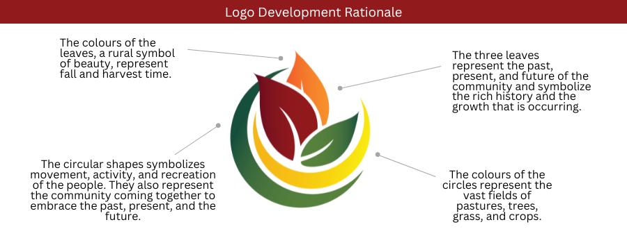
The logo’s colours reflect the beauty of fall and harvest season - an important symbol of the Township’s strong agricultural roots. The three leaves represent the community’s past, present, and future, honouring its rich history while recognizing continued growth. The circular design symbolizes movement, connection, and the active lifestyle that brings the community together.
The tagline reflects Asphodel-Norwood’s vibrant and growing community, helping to position the Township as a welcoming place to invest, live, and raise a family in a safe and friendly environment.
Since its introduction, the Township’s brand has been gradually integrated across communications and materials.
The Township extends its sincere thanks to all those who contributed their time, feedback, and insight throughout the process.

Contact Us
Township of Asphodel-Norwood
2357 County Road 45
Norwood, ON K0L 2V0
P: 705-639-5343
F: 705-639-1880
